

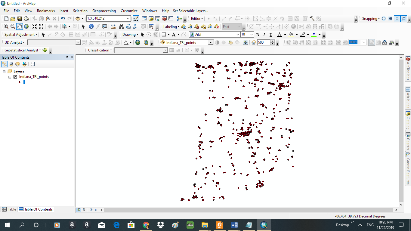
- Considering the State of Indiana as a whole, do there appear to be any geographic concentrations of TRI points? (e.g., northeast, southwest, near urban areas, near specific urban areas, etc.)
ANSWER:
As evidenced in the screenshot below, there is a concentration of the Tri points for the year 2016 on the Northern part of the map. The center also has a high cluster as well as a little concentration on the Southeast part of the map.
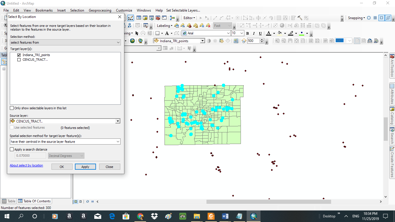
a) Use the Marion County Census tracts layer to extract the TRI points in Marion County. (Hint: select by location)
For years 1987 through 2000, use the Census tracts from the year 2000. For years 2001 through 2017, use the Census tracts from the year 2010. Yr. 2010 as shown in the screen shot below; selection by location focusing on the points that have their centroid within Marion County.
How many TRI facilities were in Marion County during your year? (Hint: it should be about 10%. For example, in 2008, 338/3585 [9.43%] of Indiana TRI points were in Marion County.)
- My TRI year: ____2016______________
- Indiana TRI points: ____3528______________
- Marion County TRI points: _____300_____________
- Percentage or Indiana TRI points that are in Marion County: _____8.503%___________
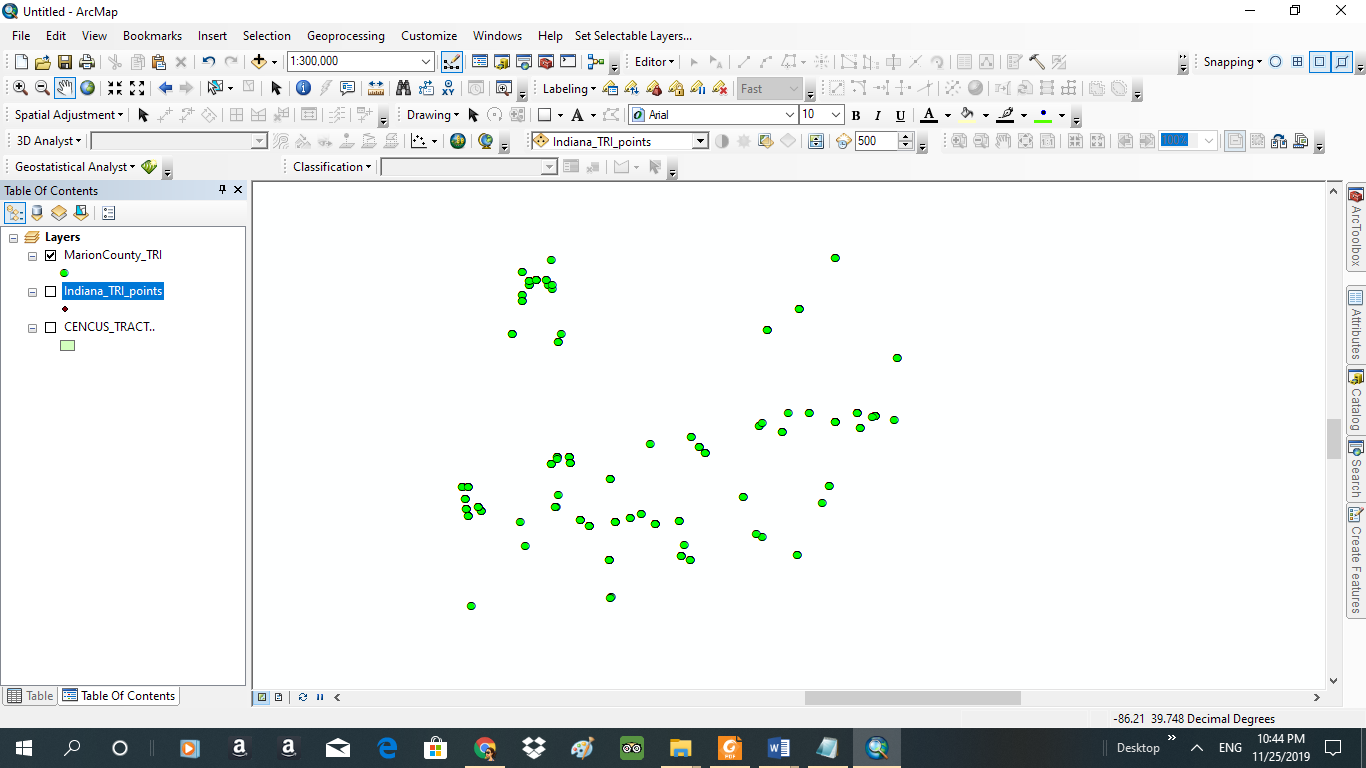
Considering just Marion County, do there appear to be any geographic concentrations of TRI points?
ANSWER: The concentration of the Tri points are towards the south part of Marion County and are spread out across the southern region. There is a cluster towards the Northwest side but the number is low compared to the southern points. This is evidenced in the map below.
. Enhanced visual analysis using the kernel density tool
- Navigate to the “Geoprocessing” menu and choose “Search for Tools”
- In the search box that pops up, type “kernel density” and press enter.
- Open the Kernel Density tool by clicking the link that reads “Kernel Density (Spatial Analyst) (Tool)” A popup window should appear.
- Input features: your Marion County TRI points
- Population field: should be “NONE”
- Output raster: save to your project geodatabase
- Search radius: enter “0.05” (no quotation marks)
- Click “OK”. The tool may take a minute to run.
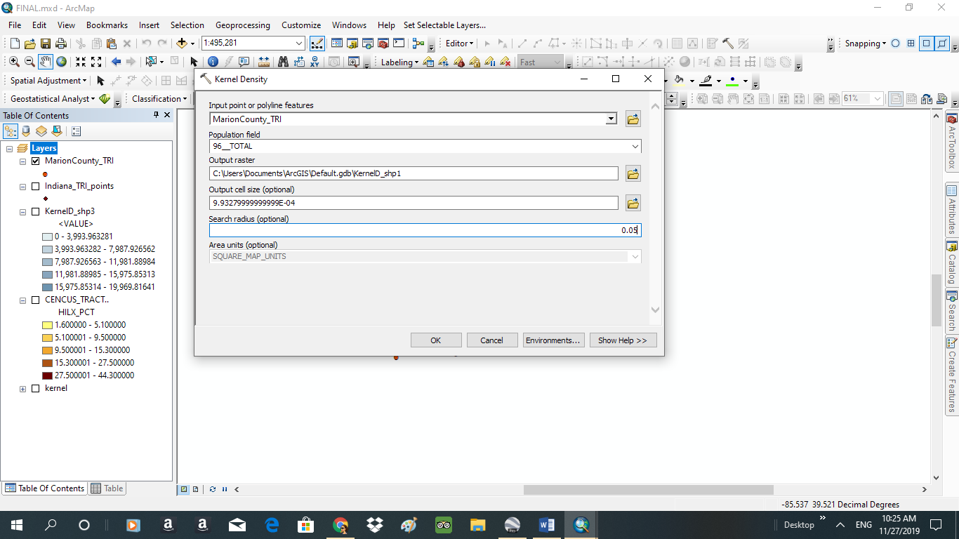
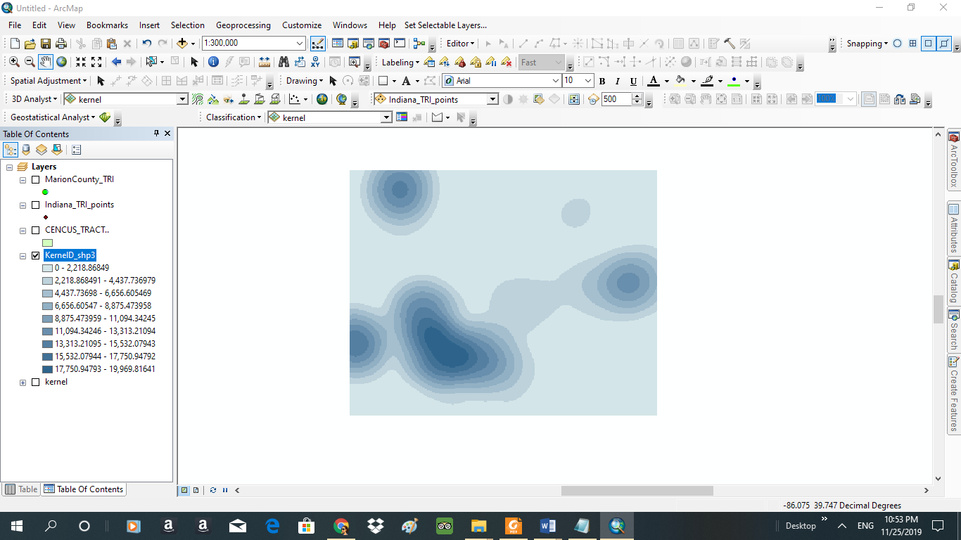
Compare your answer from part 4.c. above with the kernel density image that you just created: The data from the Kernel Analysis gives raster image simulating areas with high tri points using a darker shade as shown in the screen shot below:
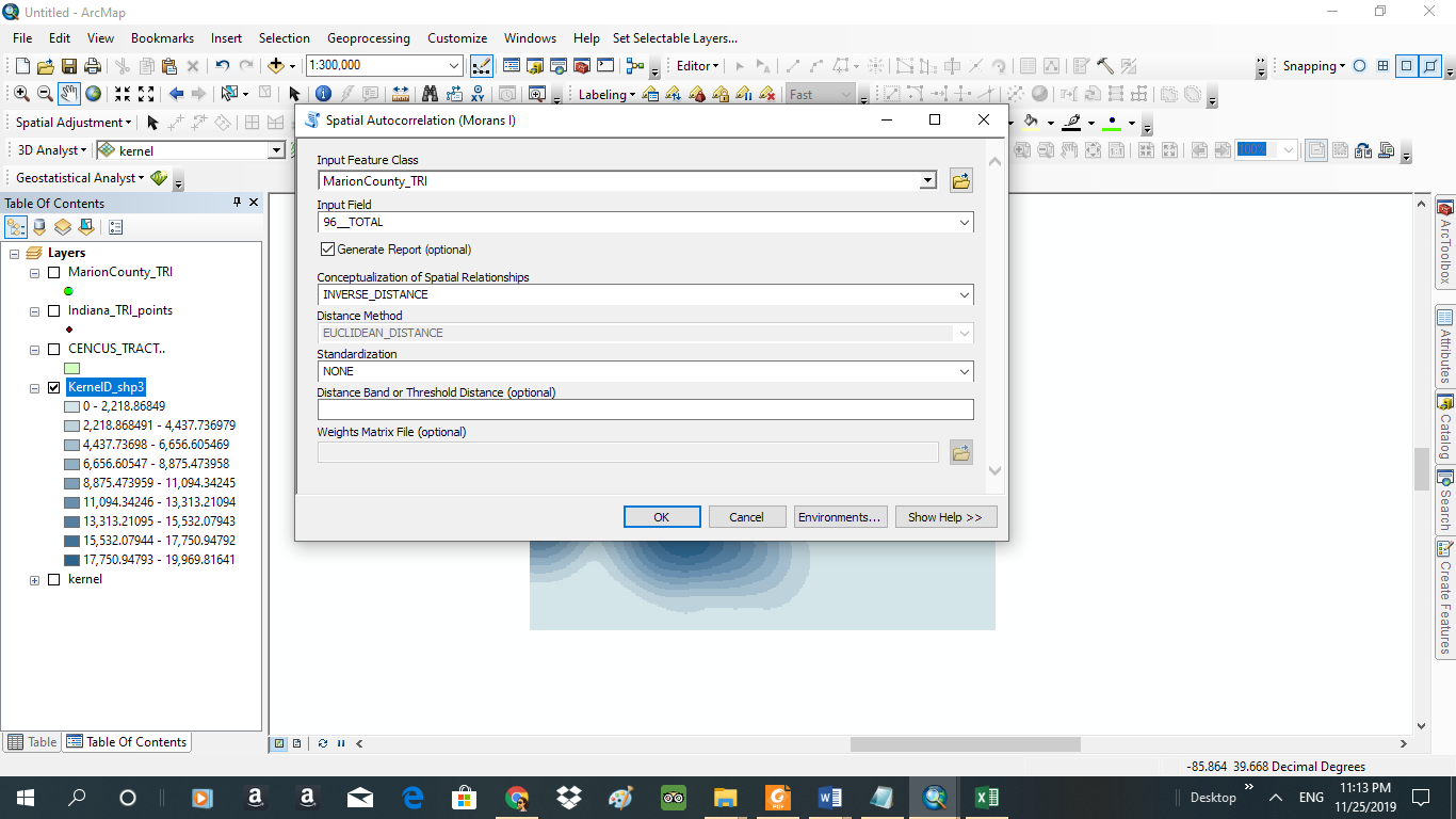
Statistical analysis of clustering using the Global Moran’s I (spatial autocorrelation) tool/calculation.
- Navigate to the “Geoprocessing” menu and choose “Search for Tools”
- In the search box that pops up, type “Global Moran’s I” and press enter.
- Open the Spatial Autocorrelation (Global Moran’s I) tool. A popup window should appear.
- Input features: your Marion County TRI points
- Input field: C_96 (this is the field indicating the total amount of toxic releases)
- Generate a report (check the box)
- Click OK to run the tool.
- On the Geoprocessing menu, open the “Results” window.
- Your most recent result should be the Moran’s I calculation.
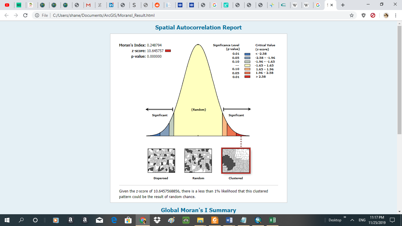
- Report your statistical results here:
- Z-score: ___10.645757_______________
- P-value: ____0______________
- Double click the link immediately below the P-Value statistic called “Report File: MoransI_Result”. This will open a “Spatial Autocorrelation Report”
- Does the Moran’s I calculation indicate that there is significant clustering in the data? YES. As evidenced by the image below, there is a 1% chance that the clustered pattern could be the result of random chance.
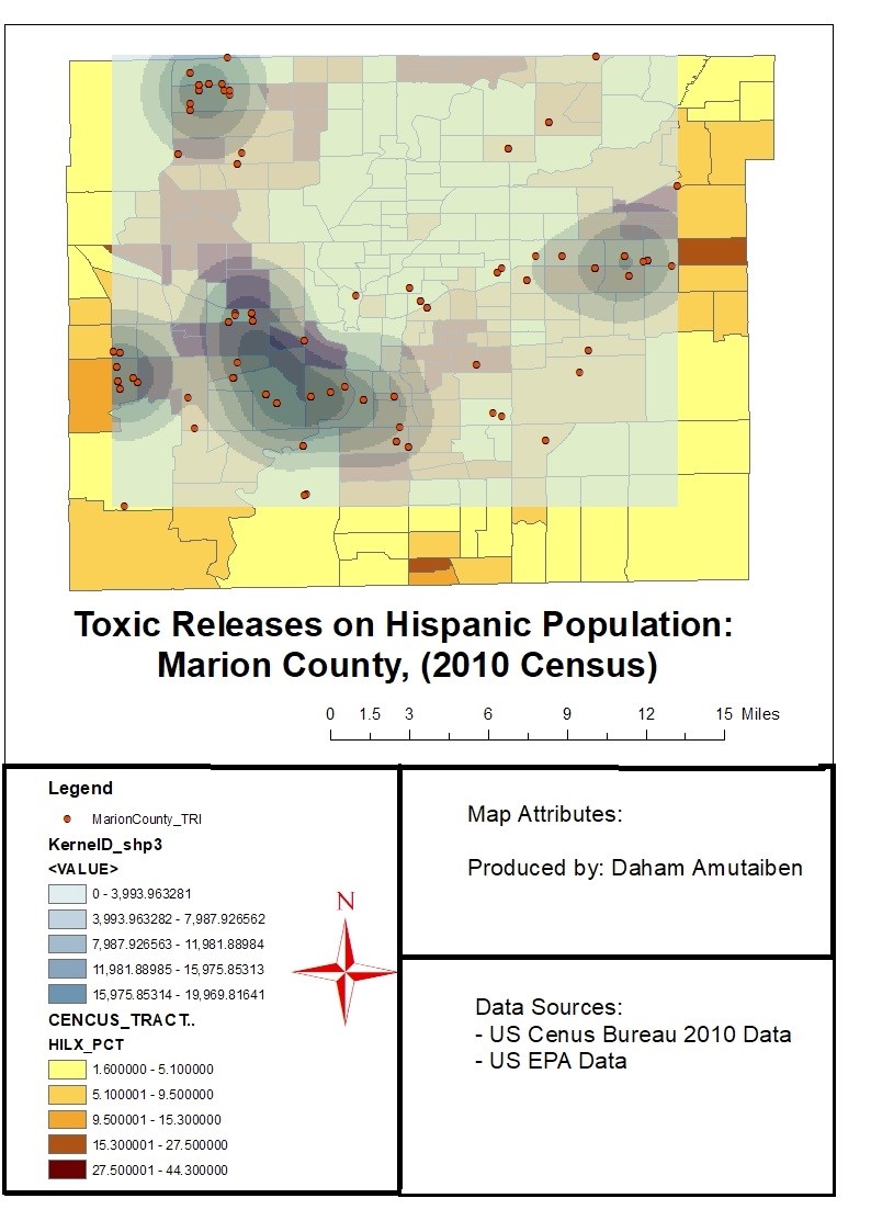
FINAL MAP

1 Comment
[…] reclassified raster datasets. The conversion of the datasets into a compatible file facilitated the analysis in a GIS environment. The datasets are as represented in the chart […]