
Creating Stunning Heatmaps in QGIS
Heatmaps are powerful visualization tools that help identify patterns, clusters, and hotspots in your spatial data. Whether you’re analyzing crime incidents, population density, or customer locations, QGIS provides robust tools for creating professional heatmaps. This comprehensive tutorial will guide you through the entire process.
What You’ll Learn
By the end of this tutorial, you’ll be able to:
- Prepare point data for heatmap analysis
- Use QGIS’s Heatmap plugin and processing tools
- Customize heatmap styling and symbology
- Export high-quality heatmap visualizations
- Apply advanced techniques for better results
Prerequisites
- QGIS 3.16 or later installed (Download QGIS)
- Basic familiarity with QGIS interface
- Point vector data (we’ll provide sample data)
Video Tutorial
Watch our step-by-step video guide to creating heatmaps in QGIS
Sample Data Download
Before we begin, download our sample dataset:
- Crime Incidents Dataset (CSV) – Contains lat/lon coordinates
- Population Centers (Shapefile)
Step 1: Preparing Your Data
Loading Point Data
- Open QGIS and create a new project
- Add your point layer:
- Go to
Layer > Add Layer > Add Delimited Text Layer - Browse to your CSV file
- Ensure X and Y fields are correctly identified
- Set the correct CRS (Coordinate Reference System)
- Go to
Data Quality Check
Before creating heatmaps, verify your data:
- Remove duplicate points
- Check for null coordinates
- Ensure proper projection (use UTM for local analysis)
Pro Tip: Use Vector > Data Management Tools > Remove Duplicate Geometries to clean your dataset.
Step 2: Creating Your First Heatmap
Method 1: Using the Heatmap Processing Tool
- Open Processing Toolbox:
- Go to
Processing > Toolboxor pressCtrl+Alt+T
- Go to
- Find the Heatmap Tool:
- Navigate to
Interpolation > Heatmap (Kernel Density Estimation) - Or search for “heatmap” in the search box
- Navigate to
- Configure Parameters:
- Input Point Layer: Select your point layer
- Radius: Start with 1000 meters (adjust based on your data)
- Output Raster Size: Choose pixel size (smaller = higher resolution)
- Kernel Shape: Quartic (recommended for most cases)
- Weight Field: Optional – use if you have intensity values
- Run the Tool: Click “Run” and wait for processing
Method 2: Using the Heatmap Plugin (Alternative)
If you prefer the plugin approach:
- Install the Heatmap plugin via
Plugins > Manage and Install Plugins - Access it through
Raster > Heatmap
Step 3: Styling Your Heatmap
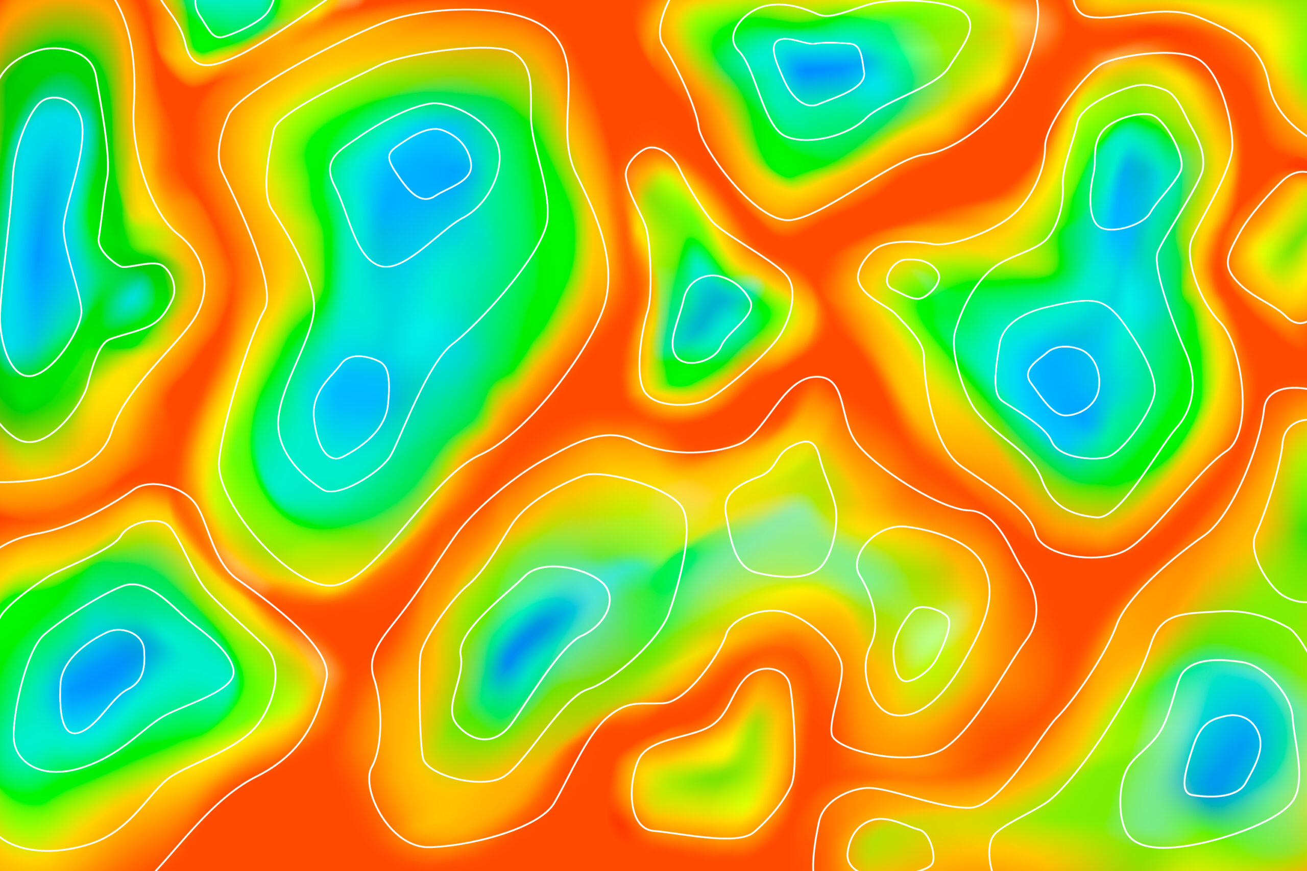
Applying Color Ramps
- Right-click your heatmap layer >
Properties - Go to the Symbology tab
- Render Type: Single band pseudocolor
- Color Ramp:
- Try “Reds” for traditional heatmaps
- “Spectral” for multi-color visualization
- “YlOrRd” for yellow-orange-red gradient
Advanced Styling Options
- Mode: Use “Equal Interval” or “Quantile” for classification
- Classes: 8-10 classes work well for most heatmaps
- Transparency: Add 20-30% transparency for overlay effects
- Blending Mode: Try “Multiply” when overlaying on base maps
Step 4: Adding Context with Base Maps
Adding OpenStreetMap
- Browser Panel: Expand
XYZ Tiles - Double-click: OpenStreetMap to add as base layer
- Layer Order: Ensure heatmap is above the base map
Using QuickMapServices Plugin
Install QuickMapServices for more base map options:
- Google Maps, Bing, CartoDB, and more
Plugins > Manage and Install Plugins> Search “QuickMapServices”
Step 5: Fine-tuning Parameters
Optimal Radius Selection
The radius parameter significantly affects your heatmap:
- Too small: Scattered, disconnected hotspots
- Too large: Over-smoothed, loss of detail
- Rule of thumb: Start with average distance between points
Testing Different Radii
Create multiple heatmaps with different radii:
- 500m, 1000m, 2000m, 5000m
- Compare results and choose the most meaningful
Step 6: Advanced Techniques
Weighted Heatmaps
If your data has intensity values:
- Use the Weight Field parameter
- Examples: crime severity, sales volume, population count
- Higher weights create stronger hotspots
Multi-temporal Analysis
For time-series data:
- Filter data by time periods
- Create separate heatmaps for each period
- Compare patterns over time
- Use the Temporal Controller for animation
Clipping to Study Areas
Limit heatmaps to specific boundaries:
Raster > Extraction > Clip Raster by Mask Layer- Use administrative boundaries or custom polygons
Step 7: Export and Sharing
High-Quality Map Export
- Print Layout: Create a new print layout
- Add Elements:
- Map frame with your heatmap
- Legend with clear labels
- Scale bar and north arrow
- Title and data sources
- Export Options:
- PDF for print-ready maps
- PNG/JPEG for web use
- SVG for further editing
Interactive Web Maps
Convert your heatmap to web format:
- Use
qgis2webplugin for Leaflet/OpenLayers export - Export as GeoTIFF for web GIS platforms
Common Issues and Solutions
Problem: Heatmap appears blank or uniform
Solutions:
- Check your data projection
- Verify coordinate fields are numeric
- Ensure points aren’t all in one location
- Adjust radius parameter
Problem: Processing takes too long
Solutions:
- Reduce output raster resolution
- Filter data to smaller area
- Use fewer input points for testing
Problem: Heatmap doesn’t align with base map
Solutions:
- Ensure all layers use same CRS
- Enable “on-the-fly” projection
- Reproject layers to common coordinate system
Best Practices
- Data Preparation:
- Clean and validate coordinates
- Remove outliers and errors
- Consider data privacy implications
- Parameter Selection:
- Test multiple radius values
- Choose appropriate cell size
- Consider your analysis scale
- Visualization:
- Use intuitive color schemes
- Add proper legends and labels
- Maintain good contrast with base maps
- Documentation:
- Record processing parameters
- Document data sources
- Include methodological notes
Additional Resources
Official Documentation
Community Resources
Sample Datasets
YouTube Channels
Heatmaps are invaluable tools for spatial analysis and visualization. With QGIS’s powerful processing capabilities, you can create professional-quality heatmaps that reveal hidden patterns in your data. Remember to experiment with different parameters, validate your results, and always consider the story your visualization is telling.
The key to successful heatmap creation lies in understanding your data, choosing appropriate parameters, and effective visualization techniques. Practice with different datasets and scenarios to master these skills.
What’s Next?
Ready to advance your QGIS skills? Check out our related tutorials:
Have questions? Talk to our experts. We’re here to help you succeed with your GIS projects!